Knowing who you (and your team members) need to talk to in a project is essential. There may be dozens or even hundreds of people involved, each with a specific role.
A project organization chart clarifies the team structure and responsibilities.
Here I am sharing with you my project organization template for Powerpoint.
Project organization chart template
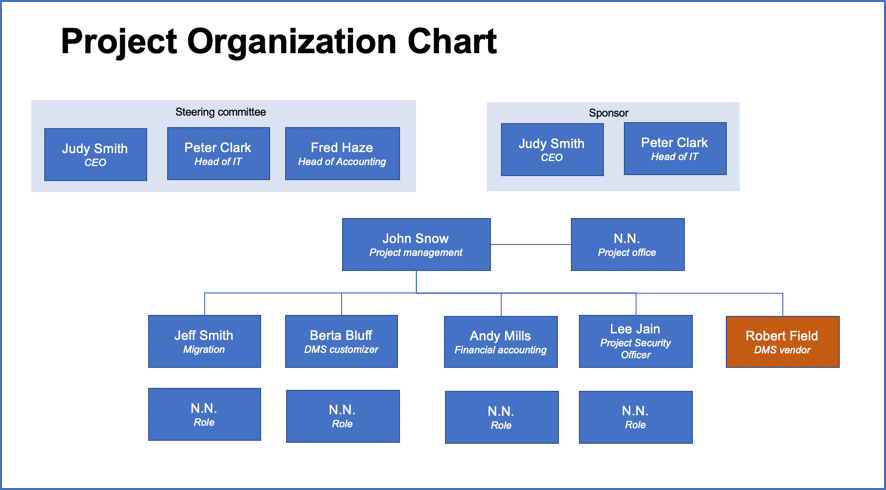
The organization chart template I use is very simple, and that’s a good thing (there’s no reason it has to be complicated). It is just a one page PowerPoint which contains all the elements you need for creating your own project org chart.

Click to download the template
The template is structured in the following way: at the top you find the senior management level roles, like the steering board and the project sponsor. Below, you have the project manager as the central role including any PM support staff roles.
Below the project manager you find the actual project team — the people doing the work 🙂 . The boxes (showing the roles and people behind a role) are connected with lines which indicate the line of reporting.
Like any good project org chart, the template also lists out the actual people behind the roles. This way you always know what function somebody performs in a project, for example developer, migration expert, project security officer or something else (read also about defining roles and responsibilities in a project).
To create your organizational chart, simply download my template and map out the roles for your project. The graphical elements like rectangles can easily be copied if you need further boxes. Once you have drawn the boxes, you connect them with connector lines in Microsoft PowerPoint.
To make the org chart easy to grasp, I recommend using different colors. For example, you can use separate colors for different business functions or different sub teams.
You can also group roles that belong together by drawing a rectangle around those boxes. I have done this for example for the steering committee in the picture above.
Make sure you properly align the boxes so that the project org chart looks nice. Even though you are not doing this for some arts contest, you still want it to look professionally, because it’s going to be seen by management. And it doesn’t leave a good impression if your chart looks sloppy.
To properly align all graphical elements , use the following functions in MS PowerPoint: distributing objects so that the boxes are evenly distributed across the width of the screen and also align the edges of the boxes so that they’re all on the same level.
Did you like the template? If yes, leave a comment below.
Author
-
Hi, I’m Adrian, a Senior Project Manager and the Creator of Tactical Project Manager, where I teach a pragmatic approach to project management. Led large-scale IT and business projects for over 10 years. My goal is to enable you to lead any project with confidence.
View all posts


